More video, author animations, immersive interaction, and user-specific adaptations. A return to the aesthetics of the 90s and 00s, timeless art deco classics, an emphasis on font and message, brutal design “without design”, the aesthetics of billboards and street culture, the flowering of patterns, abstracts and complex shapes, the synthesis of graphics and photos, a return of the gradient craze, glass effects and the versatility of crystals. This is where the web design world is heading at the turn of 2022.
Let’s take a closer look at the key trends with examples.
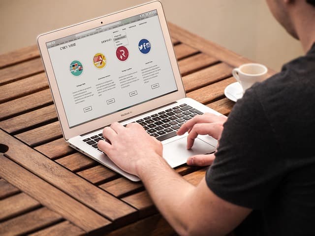
Video, animation and motion design
The most powerful and long-playing trend says that modern sites should be “live”, dynamic, reflecting certain processes, the flow, development. How to achieve this? There are dozens of options – you can choose any, it all works.
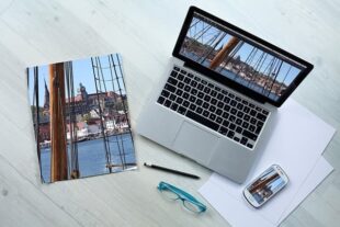
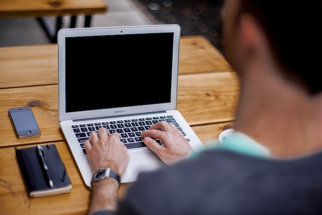
To start with a simple – users of all ages, statuses and types love videos. Statistically it attracts attention and sells many times better than any selling texts or static images. A video phone on your home screen is probably the first and best change your site deserves right now.
Creating a brief “About the company in 2 minutes” video would also be a great solution in the spirit of the times, as well as converting (at least partially) your portfolio to video format: became/has been, timelapse of work, selected moments of installation/installation/creation of whatever. Plus, video testimonials. It’s time to forget about thank you letters with stamps. People do NOT believe texts, but they believe real people you can hear and see.
Another way to bring a site to life is through immersive scrolling. That is, the site changes, transforms before the user’s eyes as he scrolls through it, it’s like he’s interacting with it, telling his story. The background changes, individual elements zoom in, highlighted, dimmed, appear from different points (not only at the bottom, but also on the side, or in the manifestation from the center of the screen), running arrows, animated infographics.
Finally, the third way is a variety of animations:
animated cursor changing its shape or size when hovering over certain blocks attracts attention, keeping the user on the site while it “plays”. customizable animation effects for the loading window, keeping the user’s attention while waiting; animation in logos; micro-animation, when the splash screen shows the user not just an image of, say, a city, but the city in which cars are driving, smoke is coming from the chimneys, windows are opening, and birds are flying by; 360-degree animation for displaying products (clothing, furniture, jewelry, appliances, etc.).
3D volumetric world
The manifestation of the same trend “in statics” is the growing popularity of 3D images. They also make the world on the screen more alive and touchable in their own way, as they do not transmit a flat image, and the volume, that is, bring the site into a new spatial dimension, making it more expressive.
Popularity is gaining not only volumetric images, but the volume of fonts, which can be used in headings, and even in the logo.
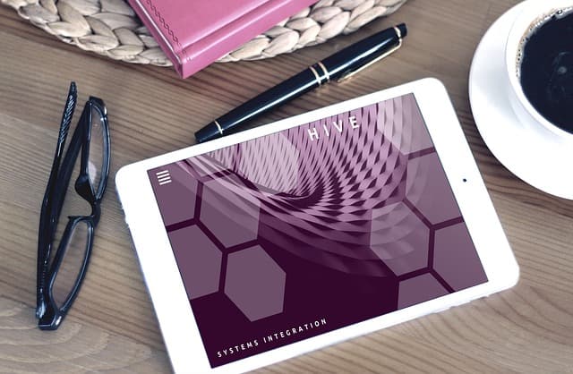
Complex shapes and outlines
One of the key messages of modern web design – the world (person, phenomenon, product, etc.) is extremely complex and multifaceted. It is like a fractal, a kaleidoscope or a crystal with many faces. Simple shapes like circles and triangles, so beloved by designers in the past decade, are no longer perceived as interesting and self-sufficient. The gaze of the user is looking for something that requires a long look, comprehension, immersion in a mosaic of elements and forms.
The supreme art in this regard would be to allow the viewer to think, unravel and evaluate your image on his or her own. No need to give ready-made solutions – preference is given to associative illustrations in the spirit of sketches, where you want to trace the course of lines, find the nodes of their intertwining to form a picture, or connect your own imagination.
Combining photos with graphics
One of the possible ways to create a complex multi-layered image would be to combine photos with graphics. The synthesis of different types of images allows you to create something quite new, at the “crossroads” of the two worlds: on the one hand, you can stylize a photo by using decorative elements, and on the other hand, breathe life into the painted elements by integrating the real image.
Abstractions, Patterns, Sketches
In a sense, abstractions are also “complex shapes”. We don’t see a “ready-made” picture of a house, a tree or a car, but we perceive color, shape, curve of lines at another – subconscious level, which gives rise to a number of associations in the head, and different for each individual person.
And in the world of web design 2022 abstractions rule! As well as patterns (repeating patterns) and drawings “by hand” in the spirit of sketches, sketches. All this follows in the spirit of the times, appealing to both hemispheres of our brain, making us not just passively perceive the ready-made image, but reinterpret it through the prism of our own experience and worldview.
Where there is room for different interpretations and associative sequences, the interaction with the user is more personal, as if he is having an internal dialogue with you. After all, he sees something that no one else sees, and everyone sees something different, never exactly the same.
Glass and crystal effect
Another “hot” trend in 2022 is the glass effect in textures and/or crystals in volumetric images. It is already being actively used in their design by trend-setting technology leaders, which means that soon this trend will spread everywhere.
Glass textures with the effect of transparency and characteristic glare / gradients are great for the design of backgrounds, substrates, buttons and other elements of the site. The important emphasis is NOT glitter, but rather matte and transparency.
Crystal shapes, in turn, are gaining popularity for use in large format images, logos, website elements. Muted, layered images with blurred competitors and countless facets, hand-drawn (not photo) are a priority – another example of “complex shapes” appealing to a world of associations.
Back to the ’90s, on the cusp of the ’00s
Did you know that some fashion trends are cyclical and rather predictable? Until recently, at the peak of their popularity was the stylistics of the 80’s, today it has already become boring and the turn of the next decade is coming: the fashion of the 90’s, characterized by a bright color palette, metallic colors, grainy textures and a certain brutality is coming back.
At the same time the appeal to the aesthetics of the noughties begins, which is next in line. Its attributes are neon colors, bright highlights with direct allusion to CDs, technology and flirting with futuristic forms.
These retro-wave organically complements the blooming of street culture, graffiti and psychedelic themes in web design – the listed phenomena were just born and actively developed in the mentioned decades. Today they have already tacitly received the status of “official” art and have turned from counterculture into one of its directions. Designers of the 2020s want to take them to a new level, rethink them and use them to find fresh solutions and approaches.
All these themes are great for products that are close to rebelliousness, innovation, freedom of expression, future-oriented, soulfulness, non-conformism.
From art deco to minimalism
At the same time, the modern picture of trends is a celebration of diversity, a kaleidoscope of possibilities and the infinity of stylistic directions. And while some are inspired by graffiti and abstractionism, others choose time-tested classics and sophistication.
Today’s “reference” classic is the Art Deco style, with its deliberate decorativeness, ornamental motifs, characteristic fonts and geometric shapes. It is chosen by projects which translate such associations as prestige, solidity, premium quality, exclusivity, unconditional style and sense of taste, refinement.
It is not necessary to literally follow all the established canons of the past – we do not set out to copy the style of the 20’s, but only to be inspired by it, offering something “based on motives”, but with a new taste and emphasis. In this regard projects that combine art deco with minimalism look especially interesting, which as a leitmotif of our time plays the main theme in everything for many years.
Minimalism remains trendy and relevant on its own, not diluted by other styles. The priority is functionality and simplicity, that is, to remove all unnecessary things as much as possible, leaving only the most critical.
Gradients
Another visual solution, which is gaining popularity is gradients and in particular multicolors. Smooth transitions of color, tone and halftone, the use of a wider and brighter palette to create a mood, blurred abstractions, jazz style, leaving the “boring” monotony – that’s what sets the direction in choosing backgrounds.
A combination of a multicolored gradient background with a photo or illustration, where all the layers are superimposed, looks fresh and stylish, so that it is hard to distinguish where one begins and another ends.
A muted palette + eco and nature theme
For every trend, there is usually a counter-trend of the exact opposite direction. If juicy, optimistic gradients don’t appeal to you, look to Scandinavian restraint. A calm, pastel, muted palette of natural shades, kraft paper, is also at the peak of popularity. Olive, beige, pale pink, gray-blue, muted mustard, cream and pistachio are perfect!
An appeal for inspiration to nature can be observed not only at the level of the color palette, but also in terms of patterns, shapes, starting points for logos and/or naming. Various stylized minimalistic patterns of flowers, grass, forests, and the sea are at the peak of popularity today. Preferably it is the patterns “by hand”, in a simplified manner with maximum stylization: tree = triangle or a set of circles of different sizes, a flower inscribed into a square, the line sets the shape of the landscape, etc.
Monochrome and dark aesthetics
Many fashion projects today choose black to create a powerful graphic accent on the site. Modern and stylish look completely monochrome projects in which the leading role is given to forms, concours, typography, and illustrations are presented, for example, in pencil shades of gray.
After many years of the “dominance” of light (white backgrounds, lots of air, free space) there is a backslide toward the dark themes of sites. They are subconsciously perceived as more weighty, aesthetic and premium.
Zero design / brutalism / design without pictures
But there are quite a few people who are tired of the endless race for new visual forms of expression. They depart from all beauty and aesthetics, and offer a counter design, or its verified and deliberate absence, thus standing out among the thousands of “equally beautiful” sites. Its signs – the simplest forms and fonts, a minimum number of colors and graphic elements, references to the era of the birth of the Internet (remember the first computers with white fonts on the blue screen menu), or the internal workspace developers (circuit, arrows, prototypes without any attempts to embellish anything).
This trend has been commonly referred to as brutalism, but it should not be confused with bad design. In the same way, quality natural makeup is far from equal to the complete absence of makeup or its inept application. Unlike “bad” sites, brutal counter-design projects do NOT scare customers away, but attract them, everything in them is in place and working to make the right impression. In some ways, the creation of such a project is even more difficult than creating a “beautiful” site in the traditional sense.
However, you should be careful when choosing this style for your site. It is most suitable for technology companies, applications and products related to IT – this is the audience will appreciate the brutalism and understand its underlying sarcasm. A wide traditional audience is more likely to be put off by this approach.
Accentuated typeface
If you’re close to the concept of minimalism and reducing the proportion of pictures/graphics/gradients/elements in a design, but brutalism seems too extreme, a great solution is to create a font project that prioritizes text and exactly how it’s written.
One common technique is to take up most of the main screen with a text message. There shouldn’t be too many words, but they should be written in a very large – huge – size and an interesting font that 1-in-1 fits the mood of your project. In this case, the picture is generally no longer needed: you can leave the background minimalistically monochrome, or use some muted images that do not draw attention.
In general, font solutions in the web are experiencing an era of prosperity – more and more projects put the emphasis not on color or shape, but on the font component.
Another unusual and fresh visual solution that partially echoes the previous theme is a minimalistic screen in the style of a billboard or a magazine editorial. It only has one message (it could be the essence of your proposal, a new product presentation, some kind of breaking news, etc.), and the background or the image below it occupies 100% of the area of the first screen of the site. No additional blocks, carousels, links, icons explaining “why you should choose us” and other “splitting” into small elements of the lower levels – all of this is acceptable (in moderation), but not in the upper face of the site, where in addition to this main message is usually left only neaktentsentirovanie menu bar.
This design can suit many projects in very different areas, but it is especially good “friends” with the concept of storytelling, when your site “tells” the story of the company or product. In this case, a certain media form and content complement and reinforce each other.
Inclusiveness, accessibility, adaptability
You might be thinking of a version for the visually impaired right now. And you’re right, but that’s only a small part of the iceberg. Users – absolutely everyone – are opting for sites that are easy to use. That is, the priority is no longer so much a memorable self-design that reflects some sort of message of the company itself, but an adaptive design in every sense, changing to suit the particular user.
What does that mean? Yes, it’s also thoughtful adaptive versions for different screen resolutions, but not only that – mobile layout has long been implied by default, today it’s time to reach new levels of adaptability.
For example, many web projects are now starting to actively add options such as adjusting the desired level of contrast or selecting light/dark presentation options. Paradoxically, but statistics show that such a simple and, at the same time, non-obvious solution as the duplication of the site in light and dark design can significantly increase interest and conversion rates. No need to choose for users at the design stage – they just want to do it themselves! To begin with, the dark theme (as in various readers) is much more comfortable for the eyes in dim lighting and in general in the evening. But beyond that, people are divided into those who visually perceive dark sites better and those who prefer light sites – and those and others are about equal. Don’t lose that other half of your customers.
Site adaptation can also go on another level – the auditory level. Think about how many people you know on messenger like to send voice messages (and how many others just freak out when they get them). Everyone is completely different. But in today’s world of web design, no one should be left out. Create another inclusive solution for those who prefer to “hear” the site (due to personal characteristics, or temporary circumstances – driving, poor eyesight, insufficient lighting, other) – which implies access to the voicing of certain elements/blocks, as well as interaction through voice commands.
These are by no means all of the gaining trends in web design, but we think they are the most striking, distinctive and promising. Combine them in different proportions, follow them, argue with them, or just ignore them. You know best how your business should “look” in the online space.