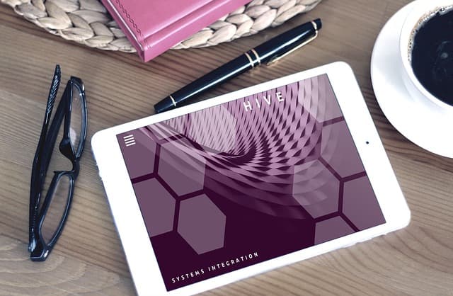
There is no clear single classification of styles. In different sources you can find variants or selections of the top 10. This is due to the fact that the niche is quite young and actively growing. In the UI-design appears 20-30 trends a year, of which 15-20 as quickly fade away, why any style changes little by little, until it does not transform into a separate movement.
Consider the main styles in the design of sites from our point of view:
● Classic;
● Minimalism;
● Drawn;
● Metro (cardboard);
● Polygonal;
● Flat (flat);
● Brutalism;
● Festival (promo);
● Grunge;
● Retro;
● Organic & Natural.
Classic Style
Simple, austere, concise and neat. It has a logically structured structure and clear navigation. All elements are located in the expected places. The classic menu at the top or side left, the usual column grid, a minimum of graphics or its complete absence.
Simple neutral colors, neat typography. Fonts are simple, common, the size of the headings are close to the standard, there is no screaming flashy solutions with an unusual size or placement of the text.
Classic style sites used by companies that do not need something in particular to stand out among competitors, they are self-confident, adhere to the rigor and brevity. Also, this style is popular in the niches of law, lawyers, industrial areas.
However, this style is displaced by modern minimalism. The trend is that young progressive companies in these areas are moving away from the boring classics to a more modern and relevant direction:
Minimalism in Web Design
Stylish, neat, spectacular. The main distinguishing feature of minimalism – a large amount of free space, the absence of unnecessary details. The emphasis on the content and photos. The grid is most often used modular. Due to the airiness and properly placed accents can control the gaze of the user, to lead him in the right direction.
I want to shout “we’re betting on this style” =). And yes, designers: you’re probably fed up with the articles on the theme of minimalism, but sorry, we can’t do without it. Moreover, this is the main style of our agency)
Modern minimalism is not a void and simplicity. We are not talking about boredom here! Often, when customers hear minimalism, they imagine a white room with white floor, white walls, white table and chair, and a cheap white closet. So ala neo-cell. But this is a wild misconception, minimalism is not about cheap and lack of everything and everything.
The color schemes are simple and minimal. Often it is one color or monochrome. In this case the color does not have to be neutral white or black. Minimalism welcomes any color solutions, if they set the right tone and accent in the right way. So our user won’t wander with his eyes in the Chinese market, he will easily find the necessary information and in a split second will understand where to click.
Images in minimalism should be in a single style, contrasting, not overloaded with small elements and of the highest quality – the emphasis is on them. The visual magic of the project is created with the help of photographs or premium 3D renderings, and the concept is set.
Typography can be very complicated or simple and laconic. Since the first place in the style of minimalism is the content, the typography is paid special attention. Fonts can be elegant with serifs, strict without serifs, large, standard, bright and modest. The choice depends on the overall mood of the site, the positioning of the brand. The main thing – nothing extraneous: the photo only on the topic, the text in a minimal amount, theses. No complicated textures of bricks under the text, volumetric textured letters, garish banners. The best example for understanding are companies such as: Bork, Apple, BornFight.
This is the most popular (and in our opinion competent) style of site design. It can be used in almost any niche, from technology to parachuting. Minimalism looks good in Fashion, Travel, Beauty, Production, Modern Technologies, IT, Personal Portfolios, Internet-shops, Interior Design. In general, it’s ideal in cases where you need to:
- Present an expensive product;
- To draw attention to photos;
- To reflect the technology, environmental friendliness;
- To convey premium quality;
- Make a user-friendly site in the end =).
Often modern, young, premium, progressive companies choose minimalism.
Picture style
Original, exclusive. Websites in this style look like just drawn. They are interesting, unusual, memorable.
Often beginners when viewing this style of site have the same reaction – wow, I want, how to do. The trick lies in the use of illustrations drawn by an artist or illustrator. That is, to create a drawn website, you need not only UI-designer, but also an artist. Accordingly, the cost of such projects is much higher and the timing is longer.
Drawing sites can be as simple, austere, neat, or super-bright, intricate, engaging: like a maze, inviting to linger to consider every detail.
Colors are used in a variety of ways, from a black and white palette, to a multicolored comic book style design.
Fonts in this style are often also handwritten, or simple, neat, classic, mostly grotesque (sans serif).
The cartoon style is used in the design of the site creative companies – souvenir stores, music groups. Also, the style is well suited for portfolio design in creative niches.
Metro style in web design
Streamlined, simple, convenient. The basis of the metro style (card style) is the principle of building a site structure using sections (cards), which are located all the main content.
This style is used for the convenience of the user in the perception of a large amount of content. Conventionally, it’s like a neatly designed newspaper in which each reader finds the card they want, among a pile of other cards, when viewing it. The easiest way to think of the metro style is to think of the Windows 8 menu with square tiles of folders, apps, and news in one package.
The Metro style is inherently minimalist, functional. Everything is aimed at the convenience of information perception. A cool feature is that this site is very easy to adapt to mobile devices. This saves time, as well as the cost of development.
Colors can be varied, up to a bunch of different colors in the design of one page. The main thing here is not to go too far and pick a well-matched combination of color schemes. Basically uses the tetrad (4 colors).
The fonts are simple, universal, without serifs. The main principle – accessibility and ease of reading. The grid on these sites predominantly modular.
Metro style is used for online shopping, corporate sites, business card sites, portfolios, blogs in various activities.
Polygonal Style
Creative, bright, futuristic. Polygonal style can be quickly defined with a quick look. The design uses geometric shapes – polygons. They can be both background images, decor elements and media content – illustrations.
Polygonal style is based on the simplification and virtualization of realistic objects with polygons – complex shapes, triangles, other geometry (3D-geometry, stereometry, broken lines). At the same time, illustrations and artistic techniques are also represented using polygons. On the one hand it may seem strange, but even in the absence of detail pictures can easily catch the author’s idea.
Strictly speaking, in sites, that straight whole layout was in polygonal style – this is an extreme rarity. Since, even in terms of CSS code, the development of such solutions – a super time-consuming process. Mostly polygonality is used in rendering logos, corporate identity elements, patterns for the background, design elements, etc. Such sites and applications are often bright, futuristic, and reflect the dynamism of the brand. Due to the contrast between the polygonal figure and the background, as well as the layered arrangement of design elements achieves the effect of depth and volume on the site.
Website in the style of geometric minimalism
Typically, additional details are absent, the text is used to a minimum, there is no other graphics, as the polygons in the spotlight and do not need excessive embellishment. In fact, the most important thing in this style – “pictures of triangles. And due to the shadows, the contrast of polygons to each other, animation, color combinations already creates a sense of dynamics and volume of the image.
Geometric Web Design
Geometric Polygonal Web Design
It is important that, as in the drawn sites, graphics (polygonal illustrations) are either purchased at stock sites, or hired artist-illustrator, or in the case of complex animated scenes – a trained Front-end developer such stories. All this + to cost, + to time.
Style Flat
Clear, simple, neat. Style Flat, or flat design, can be described as a simplified design with accessible custom solutions. The basic principle – nothing unnecessary, similar to the style of minimalism.
This style is characterized by simple two-dimensional illustrations, lack of volume, textures, gradient, 3D-effects, complex shadows and other effects. Often only one accent color is used, not bright, muted and a few complementary backgrounds.
Typography in this direction is simple, clear and accurate. This is a simple grotesques (fonts without serifs) and classic common sizes in the design of titles and body text.
Flat design is suitable for all niches of business. This corporate sites, sites of large companies, portfolios, business cards, online stores. The style gained more popularity in the UI-design of desktop interfaces and mobile applications.
Brutalism
Bright, creative and controversial. Unconventional appearance of sites in the style of brutalism causes mixed emotions among users. He either like or causes disgust and rejection. However, the style is quite popular, especially among the younger generation. It definitely attracts attention. Companies that decided to take this step are brave and openly declare themselves, without fear of criticism and condemnation.
The main feature of brutalism is a kind of chaos. There is no logic in the construction of the grid, the elements are arranged vertically in a chaotic manner. At the head of the design itself, usability and content are relegated to the background.
Acidic colors in the priority of design, often a combination of red and green shades.
Fonts can be unreadable, have a single healthy size and do not obey logic or hierarchy. By the way, those who care about SEO – do not use brutalism, as in terms of robots in the code on the site will trash, and in terms of behavioral factors and analytics services – a lot of bounce.
Animation is also not subject to a single style, and can be quite diverse: pop-ups, appearing from different sides of the elements – constant companions of the style.
Brutalism has both pluses and minuses.
On the plus side can be attributed a simple approach to design – do not need to spend a lot of time on the TOR, the study structure, grid and logic.
On the downside – the impression of the user. Not everyone goes bold and ambiguous design in this style. There is a risk of spoiling the impression and losing the user.
Therefore, because of its specific design, Brutalism has few areas of application, rather it is design for design’s sake. It can be used on marketplaces, forums, creative encyclopedias, narrowly focused portfolios, or unconventional, creative festivals.
Festival Style
Bright, juicy, memorable. Festival style or promo style is typical for advertising events, products, brands, festivals, marketing creative and event-agencies.
An important criterion – spectacularity. It is necessary to stand out, to remember, to impress, to create a wow-effect. Mostly, festival sites are created as landing pages, because it is complicated, long and very expensive both at design and development stages. Therefore, in 90% of cases these are purely presentation advertising pages. To put it bluntly – it’s a design to show off the ponce =)
In the promo style all the emphasis on the product, the brand. The minimum of text, a maximum of animations, visualizations. Important form of presentation, the description is relegated to the background. Often graphics, complex 3D-effects, motion and video are used in the design. There are no clear rules for this style – the more effective and creative, the better. Often it’s just a mix of “brutalism and adequacy” from the previous point.
In color solutions in the first place – the colorfulness. Juicy contrasting colors, triad or tetrad, possibly acid colors, all kinds of glow, often a dark background to enhance the saturation – all this promotional style.
The text plays a secondary role, mostly using headlines, slogans, appeals, point theses. This is also where to turn, and allowed the most unconventional solutions in the design. Titles can be huge, and can be – a classic size, it’s neat grotesque or ornate decorative (accent) fonts. By the way antiqua (serif) is very rare in promotional sites, rather if you use a decorative font, it will be something handwritten, like the logo of Coca-Cola.
The grid also serves the spectacular and can be as simple as possible, and complex hierarchical, with overlays, the heterogeneity of sizes of objects and other things.
Festival style sites are used in a variety of niches. Its main purpose – advertising. This can be video studios, development agencies, festivals, galleries, brands, products, personalities, marketing, creative, event-agencies and others.
Grunge
Extravagant, brutal, creative.
This style can be described as rebellious. Bold and careless.
In translation from English grunge – repulsive, unpleasant.
The distinctive features of this trend are dark, dirty colors and textures, untidy arrangement of elements, a complex grid or at all broken rules of composition.
The colors used in the Grunge style are brown, gray, black, marsh green, dark orange. You can often find in the design various textures, patterns (e.g., notebook cage), cracks, scuffs. In addition, various small details – badges, emblems – are often used in the design.
Font solutions are as bold, daring, as the style itself – large size texts, handwritten or non-standard fonts, 3D-effects.
Grunge style is so specific, that it should be used wisely and where it’s appropriate. The business, and more importantly its audience, should be bold, epatastic, and ready for this style. This can be a rock band, a brutal bar, a barber shop, an online store of the corresponding direction, the site of the festival, a young brave company rebel.
Retro
Vintage, eclectic, spectacular. Retro style references the past, an era when books, newspapers, magazines, turntable records were popular. Usually serves to recognize the brand or to emphasize the relevant subjects.
This style is characterized by illustrations and photographs on the subjects of past times, people in the clothes and interiors of the past centuries, old technology.
Muted pastel colors, worn effects, textures of old paper and wood, including patterns and monograms are used in color design.
Typography is characterized by serif fonts, bar fonts as a reference to the typewriter times, handwritten fonts and lettering.
The retro style is usually used for websites of companies with similar themes like vintage stores and exhibitions, retro cars and also portfolios of photographers, designers and artists.
Organic & Natural
Fresh, light, aesthetic. This style is gaining more and more popularity. Everybody is talking about ecology, they want to reduce consumption of plastic and other harmful products, and to switch to natural composition. It can be seen everywhere: in clothing, food, electricity, household.
A distinctive feature of this direction is the use of natural materials and textures in the design. This wood, plant motifs, natural colors and shades. All the attention to decoration. Structure and logic take second place.
In color solutions also the main are natural shades: beige, brown, green, blue. Often these are muted pastel colors, or, conversely, bright, juicy combination of cerulean, lettuce and the like.
Typography is neat and inconspicuous. Classic grotesques, modest, feminine decorative fonts.
The design uses decorative elements: leaves, lines, flowers, animals, birds.
The grid is simple and logical. Usually a column or block.
Websites in this theme are popular in the same niches and brands. This can be business cards, corporate websites, weblinks on natural themes, online stores, such as flower stores, clothing, beauty care products, any eco-business.
A variety of site design styles
In addition to these styles of UI-design, on the expanses of the Internet stroll futurism, art deco, Hi-tech and many others. Often, design styles can use similar solutions and techniques can perfectly combine and complement each other, making the design more integral. And from these combinations are born new styles, from them new trends, from established trends new combinations and so on in a circle … It is almost impossible to follow it =).
But there are variations that are not compatible. For example, it will be strange to see brutal grunge with natural motifs or minimalism :)))
It is important to learn not only to identify the styles of the site, but combine them intelligently, and determine which style will reflect the tone of voice of the brand, and fit into the design for a particular task. So if you’re going to take a risk, then be prepared for an unexpected outcome. Take risks consciously.


