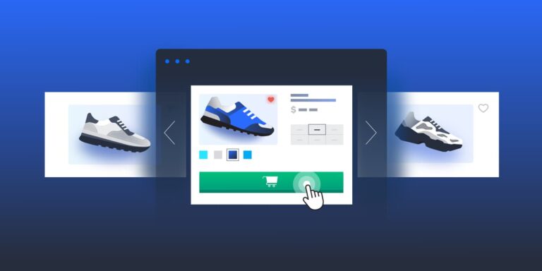
In today’s digital age, web design has evolved far beyond mere aesthetics. It’s not just about creating visually appealing sites; it’s about designing experiences that connect with users on a psychological level. Every element of a website—its layout, colors, fonts, and interactivity—can influence how users think, feel, and behave. Understanding human psychology is crucial for developing web designs that grab attention, foster trust, and encourage specific actions. To fully grasp the strong link between web design and psychology, it’s essential to examine how various website elements influence the mind and guide user behavior.
The Power of First Impressions
Humans are wired to make snap judgments. Studies suggest that it takes a visitor less than a second to form an impression of a website. This first impression is crucial because it determines whether the user will stay on the site or leave. If the website looks unprofessional or confusing, visitors are likely to abandon it, never to return. On the other hand, a clean, well-organized design can immediately build trust and encourage users to engage with the content.
Visual hierarchy plays a major role in this initial judgment. Web designers use layout and spacing to guide the viewer’s attention. For example, important elements such as headlines, calls to action, and key images are placed prominently on the page to capture the user’s focus quickly. Users’ eyes typically follow a predictable path, often in an F-pattern, starting from the top left corner of the page. Designers use this to strategically place important information where users are most likely to notice it immediately.
The Psychology of Color
Color is one of the most powerful tools in a designer’s arsenal because of its profound impact on human emotion and perception. Different colors evoke different feelings and associations. For example, blue is often seen as trustworthy and calming, which is why it’s commonly used by financial institutions and healthcare providers. Red, on the other hand, is associated with energy, urgency, and passion. It’s frequently used in call-to-action buttons because it grabs attention and encourages immediate action.
Designers must also consider the target audience when choosing colors. Cultural differences can influence how colors are perceived. In Western cultures, white is associated with purity and cleanliness, while in some Asian cultures, it symbolizes mourning and death. Gender can also play a role in color preferences. Studies have shown that women tend to prefer softer, more muted colors, while men lean toward bolder, more saturated tones. By understanding these nuances, designers can select color schemes that resonate emotionally with the intended audience.
The Importance of Typography

Typography, or the art of arranging text, is another critical component of web design that affects how users interpret information. The font style, size, and spacing all contribute to readability, legibility, and even the emotional tone of a website. Serif fonts, which have small strokes or lines at the ends of letters, are often perceived as more traditional and formal. Sans-serif fonts, on the other hand, are seen as modern, clean, and accessible.
The size and hierarchy of text also impact user experience. Headings and subheadings should be larger and more prominent than body text to help users scan the page efficiently. Employing bold or italicized text can draw attention to critical points, directing users’ focus to important details.
Line length and spacing are crucial for readability. If the text is too tightly packed, users may feel overwhelmed and abandon reading. On the other hand, text that’s too spread out can be difficult to follow. Designers aim to find a balance that makes reading comfortable and enjoyable, ensuring that users can consume the content with ease.
Cognitive Load and Simplicity
One of the most important principles in web design is reducing cognitive load. Cognitive load refers to the mental effort required to understand and interact with a website. The more complex a site is, the higher the cognitive load, which can lead to frustration and disengagement. A well-designed website minimizes cognitive load by offering a clear, intuitive user experience.
Simplicity is key to achieving this. A cluttered or overly complicated design can confuse users and make navigation difficult. Designers should aim to present information in a straightforward, logical manner. This includes using clear and concise language, breaking up long paragraphs into smaller sections, and incorporating visuals to aid understanding.
Navigation is a crucial element of simplicity. Users should be able to find what they’re looking for without having to think too much. A well-designed navigation menu is intuitive, often employing familiar patterns such as horizontal bars or dropdown lists. Additionally, clickable elements such as buttons or links should be clearly distinguishable from other text, preventing users from accidentally overlooking key actions.
The Role of Images and Visuals

Humans are inherently visual creatures, and the use of images in web design can have a significant impact on user engagement and retention. Studies have shown that people remember images more easily than text. By incorporating relevant and high-quality visuals, designers can enhance the overall user experience and reinforce key messages.
However, it’s essential to choose images thoughtfully. Generic stock photos can feel inauthentic and may detract from the credibility of the website. Instead, designers should aim to use original, meaningful visuals that resonate with the target audience. Images should also be optimized for quick loading times, as slow-loading visuals can frustrate users and negatively impact their experience.
The use of visuals isn’t limited to photographs. Icons, illustrations, and infographics can also enhance a website’s design by providing visual cues and aiding in the explanation of complex information. For instance, a well-placed icon next to a call-to-action button can help users understand its purpose more quickly, while an infographic can break down data into an easily digestible format.
Emotional Triggers in Web Design
Web design can also tap into emotional triggers to influence user behavior. Certain design elements can evoke specific emotions, which can then lead users to take particular actions. For example, the use of urgency, such as countdown timers or limited-time offers, can create a sense of scarcity, prompting users to make faster decisions. Similarly, social proof, like testimonials or user reviews, can instill a sense of trust and credibility.
The emotional journey of a user should be carefully considered throughout the design process. A website that makes users feel comfortable and confident is more likely to lead to positive interactions, whether that’s making a purchase, signing up for a newsletter, or simply spending more time exploring the site.
Trust and Credibility
Trust is one of the most critical factors in web design. Users are unlikely to engage with or make transactions on a website they don’t trust. There are several design principles that can help build credibility. First and foremost is professionalism. A clean, polished design with no broken links, typos, or out-of-date information gives users confidence that the site is trustworthy.


